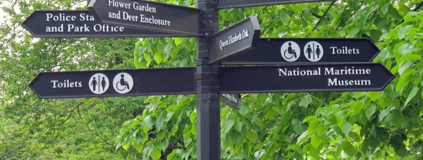
Do the signs of our time work?
If you live in an urban, suburban or even exurban environment you will encounter a number of signs.
Signs may be so pervasive like the ones that are placed in subway cars or they may be intermittent, such as those placed beside interstate highways. Although signs are part of the visual landscape, most people ignore them until they have specific needs. In other settings, however, signs may overwhelm us, and our perception of our surroundings.
Take for example, New York City’s Times Square, where numerous billboards electronic or otherwise, compete for our attention, along with the distracting street culture (including other people standing, walking or performing) in this area. Alternatively, again taking NYC as an example, the Lower East Side and East Village is inundated with graffiti and street art. These items incorporate numerous messages competing for attention and often in dialogue with each other. In these locations it’s hard not to be overwhelmed with the visual information.
The purpose of signs
Signs are supposed to help, to assist, to instruct, and to influence. The most common ones provide directions for pedestrians, cyclists, or motorists to enable them to make decisions regarding their movement. Most of the other signs are advertising. The person or organization that created them wants you to buy something, purchase a service, or influence your religious, political or social beliefs. Still other signs, such as graffiti or street art, can provoke. Signs are meant to signify, to tell the reader to pay attention to the communication.
Types of signs
Predictably not all signs, regardless of the type are equal, not just in their placement and messaging, but in their size, and design. Sometimes signs are text based, whereas others are primarily symbols or images, and still many incorporate all of these elements.
Signs can be simple, recognizable and universal. And the message is rarely open to interpretation. Visual art, on the other hand, which incorporates signs, symbols and imagery, typically means different things to different people. Alternatively signs can be complicated, where their message is unclear, confusing or open to interpretation. Sometimes this is by design and at others by accident.
What’s a good sign?
Predictably not all signs work equally well. Although the message might be clear, the sign may be placed in the wrong or an improper place.
Alternatively the person who wrote it did a poor job, the medium chosen was suboptimal, and the reader of the sign lacks the knowledge or skill or visual literacy to deconstruct what it means.
If a sign it going to be effective then it typically needs to communicate a message that will resonate in the mind of the reader and it must be placed in a location where the observer will see it.
We can probably distinguish how good a sign is by its’ ability to force viewers to distinguish between the signal and the noise. More specifically a question that needs to be asked is how much labor does it take the viewer to figure it out.
The problem is probably not what makes a good sign, as the field of graphic design has a number of good criteria, but why are so many good signs placed in poor locations.
What’s a bad sign?
Most signs, however are not that helpful. The design, size, and placement are poor. Some environments are better than others for placement. A poorly placed sign in an airport, for example, can lead travelers to miss their connection. A well designed sign placed on the high point of a bridge spanning a gorge or river, offering free counseling services to people who are suicidal may be located in the wrong position. What is the solution?
How can signs be more helpful?
There are numerous ways to increase the likelihood that signs are effective. These include
• Securing the services of a qualified and experienced professional to design the sign; someone who is on top of their game.
• Asking a number of people for their input on what is the best place to put the sign. In other words, don’t simply rely on the installer to make this decision.
• Always keep the audience in mind. If the message is too high brow, few people will understand the meaning.
• Take into consideration the context (where it is placed) and juxtaposition (i.e., what it is next to).
• Seek feedback from users early into the design and placement process, to minimize costs of fabrication where we have to go back to the drawing board.
These recommendations seem deceptively simple, but either because of a lack of resources, or exhaustion appear to be frequently ignored. All in all the proof is in the pudding. Individual concerned with the efficacy of signs must constantly ask themselves, does the sign work, why does it work, (and why not) and how can the sign be corrected or improved.
David Jones 大卫 琼斯
Painfully Unhelpful Sign, Greenwich Park, 12-05-2006


